OK Peeps. This year’s Kips Bay Show House was an odd affair for 2 reasons:
#1: The show house was secured on the late side and because of this, it forced designers to dash even faster to spin their magic. As a result, luscious ceilings were almost all but missing, as was much needed overhead lighting.
#2: I saw the house during a gloomy, day-long downpour. The sunless windows caused much of the house to look drearier than normal, something exacerbated by the lack of interior lighting.
However a return visit the next day, with the benefit of some sun, cast a whole new light ….pun intended….on many a room and the house in total.
Here are some trend tips and takeaways for you along with a shout-out to our design favorites.
Walls
Walls went patterned and intense. Gone was the subtle and ever elegant grass cloth.
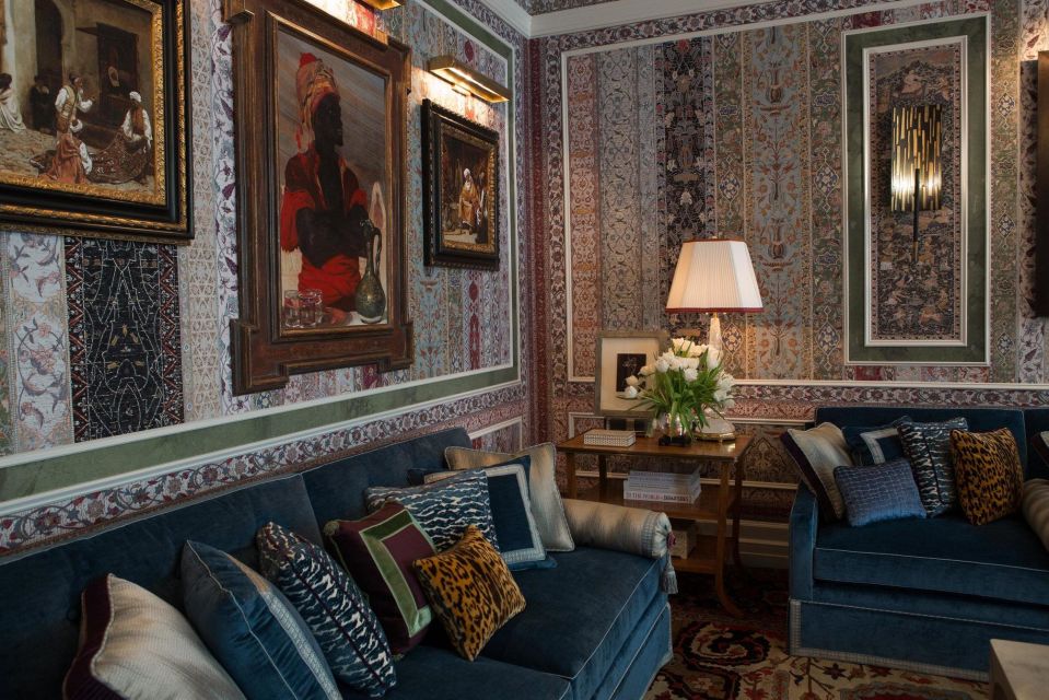
Instead there were over-scaled prints, graphics and murals. Room-After-Room.
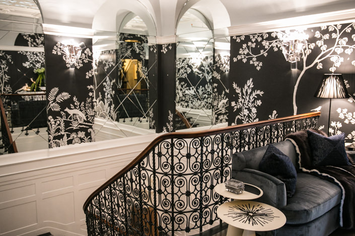
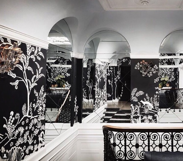
A favorite for me was Savage Interiors’ Stairway. A canvas painted with dimensional plaster, it was perfect. Its huge scale, interior placement, palpable texture and simple black and plaster white palette made it a show stopper. Architectural Digest…the foyer is calling, will you pick up?
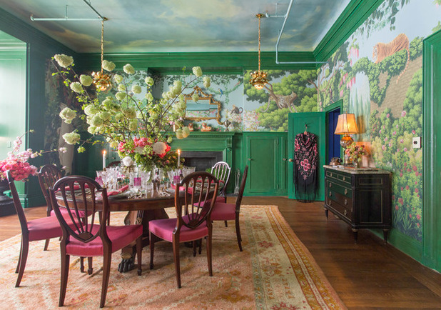
The patterned wall was the big story in the house. There was the fantasy custom mural in Ken Fulk’s “Jungle meets Alice-in-Wonderland Dining Room,”
There was 19th century inspired paper in Richard Mishaan’s parlor.
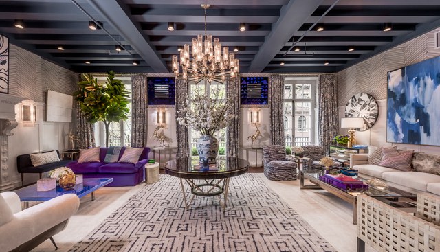
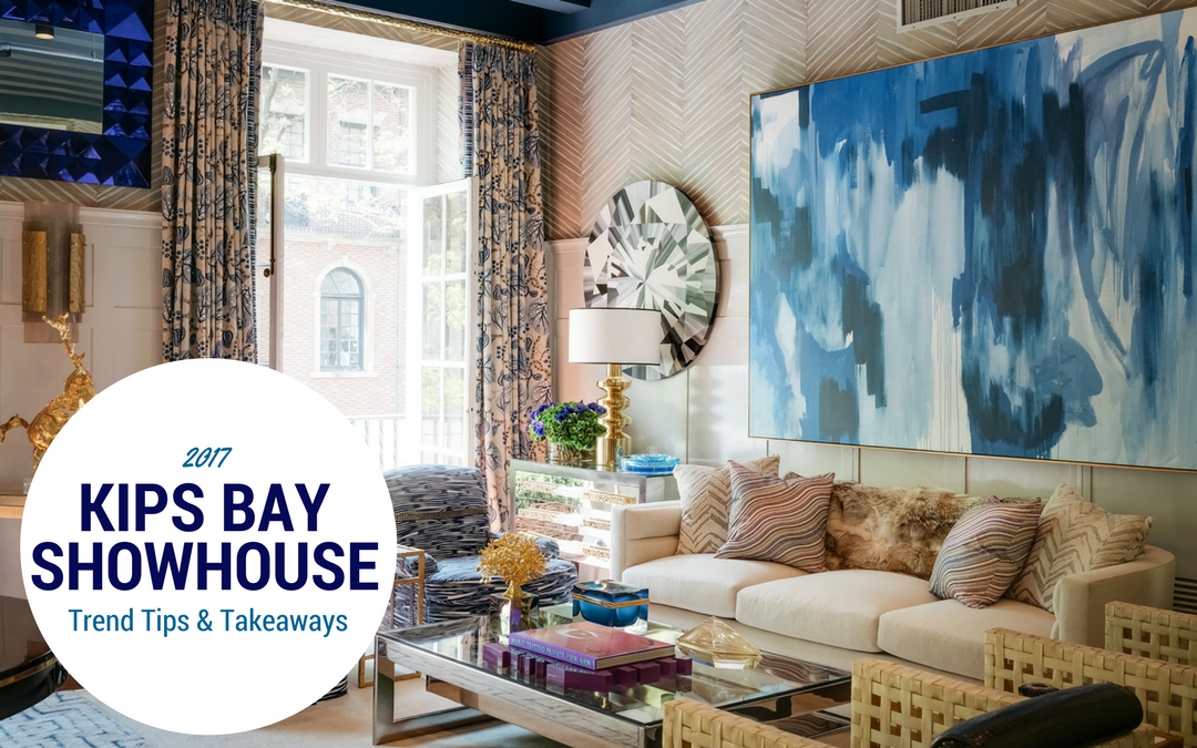
An organic feeling large scaled chevron wall covering was used in Kristen Kelli’s Living Room named “Simpatico.”
The list goes on:
When pattern hit the walls, some designers restrained their fabric plans, others did not, tossing pattern and bold color around like rice at a wedding. Sometimes it worked, but sometimes you felt like you got a grain of rice in your eye. Not a look for those who love restraint in design.
Wall Tip & Takeaway: Paper is BACK my lovelies, there’s no ignoring it any longer. Come on in, even to the shallow end with a subtle textured paper. You’ll thank me.
COLOR
The color cry was, jewel tones and go big or go home – particularly in blue or green. Color wrapped and filled rooms rather than coming in as a flashpoint accent in a space.
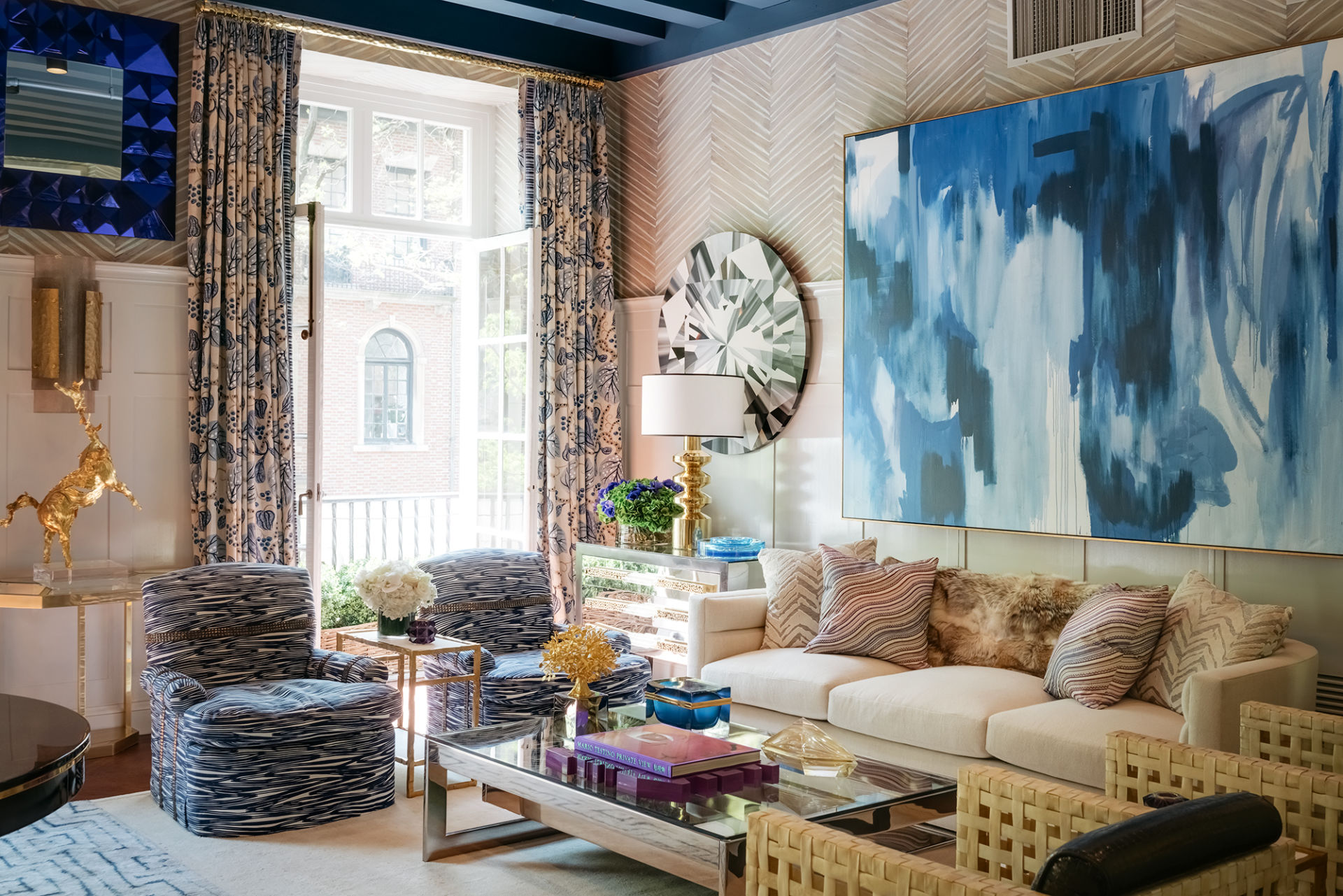
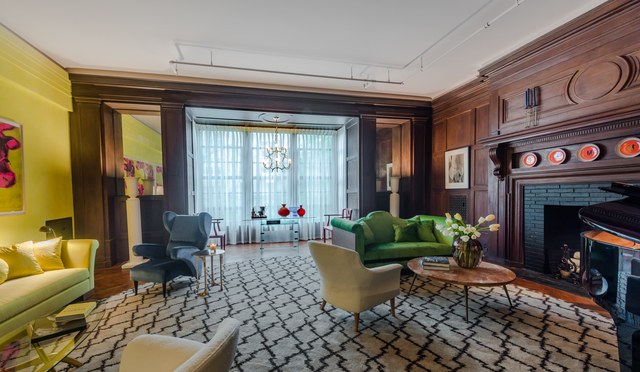
Pale gray-blue either gave way to indigo or it went royal. Greens went rich and deep like olive or into bright emerald. Bright purple was a color pop in a few rooms, and while the earth tones got warmer, gray, gray, and more gray was not the most popular story in town; COLOR was. Yellow showed up after a long absence, sunny and fresh. Red was either absent or a supporting player.
Color Tip & Takeaway: Color is doing its thing and so should you. But do it with colors you love and trend be damned. Color done well in a room will transcend any trend and there’s no more exuberant way to make a bold statement in your nest, even if you don’t have a Kips Bay budget.
PATTERN
My long predicted chevron wave was confirmed: J We are officially in a chevron trend rise. Chevron appeared in fabrics, on walls, on rug borders, and yes my dears on wood floors by way of chevron installed hardwood, but done in large scale repeats. Mmm, mmm, mmm!
Pattern Tip & Takeaway: Ok peeps, let’s see if this pattern trend blows up to overdone heights like the beloved arabesque. I hear that sniffling out there. Cheer up arabesque lovers…chevron looks yummy WITH an arabesque, it doesn’t have to replace it.
FURNISHINGS: FROM VINTAGE TO ANTIQUE
In Kips Bay years past, I always loved seeing collectable mid-century pieces sprinkled about in the most classic or modern rooms. This year, of note, there were more antiques on the scene, particularly those that harkened from the late Victorian. This latter period is a look I don’t miss and so I hope we don’t see a lot more of it.
Vintage and Antique Tip & Takeaway. Your family heirlooms just got better looking! Use them. Get them out of the spare bedroom. Re-color them, recover them, or leave them as is, but bring them into the mix. They give your rooms charm, authenticity and uniqueness.
Art
Wow, art was THE story. Art literally made some of the rooms as a keystone. In general, art was either really well done, or really overdone.
Many walls were intensely hung with marvelous large scaled art or mounted framed murals to great effect. Other walls had striking well thought out gallery wall grids where the color drove the space. Other rooms had well done asymmetrical freeform gallery art installations.
But in a few cases, rooms with heavily art-hung walls also boasted furnishings upon which even more framed art stood en masse with art leaning against the wall. Out of wall and furniture space upon which to prop just one more framed item? No problem, art was then layered on the floor and propped up against the wall, a la over stuffed art gallery.
Yes, in these few spaces restraint went out the window and the room went from art collector to hoarder, and a great place to lose your cat.
Art Tips & Takeaway:
There are 2 teaching points for you here.
- If you’ve spent any time with me before, you know I’m a big believer that getting art into your spaces is a design power move and one of the surest ways to get on track to that Pinterest perfect room.
- There is a saying….“too much of a good thing.” Even the most perfectly creamy 72% dark chocolate eaten in excess can make you reach for a Rolaid.
The lesson from the over packed art rooms is this: When a room is so crammed to the gills with anything, art or otherwise, everything and nothing becomes important. It becomes visual noise and the eye never rests.
And yes, you can do art well in your spaces. It DOES NOT have to cost a bundle, and try to make it big enough to matter. For a great art trick, take look at this video from our “vault” about using art in your spaces.
Favorite spaces:
As ever, I salute each talented designer courageous enough to put their art and heart out there for the public (and hopefully future clients and editors!) to see. Kips Bay is an impressive stripe to have on your uniform. Congratulations designers and thank you!
Design, like art is an intensely personal taste. But here for my readers are some of my favorites from Kips Bay Show House 2017.
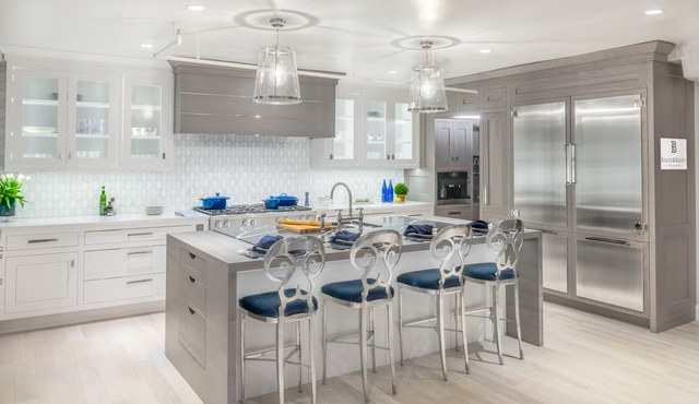
Kitchen by Bakes & Kropp: Lovely, stylish and serene. Mmm.
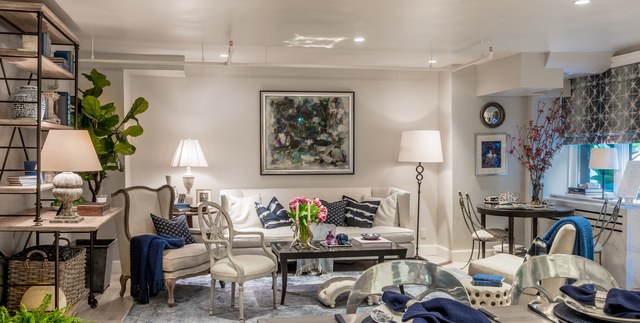
Family Room by Kate Singer Home: Ditto and well connected to its kitchen.
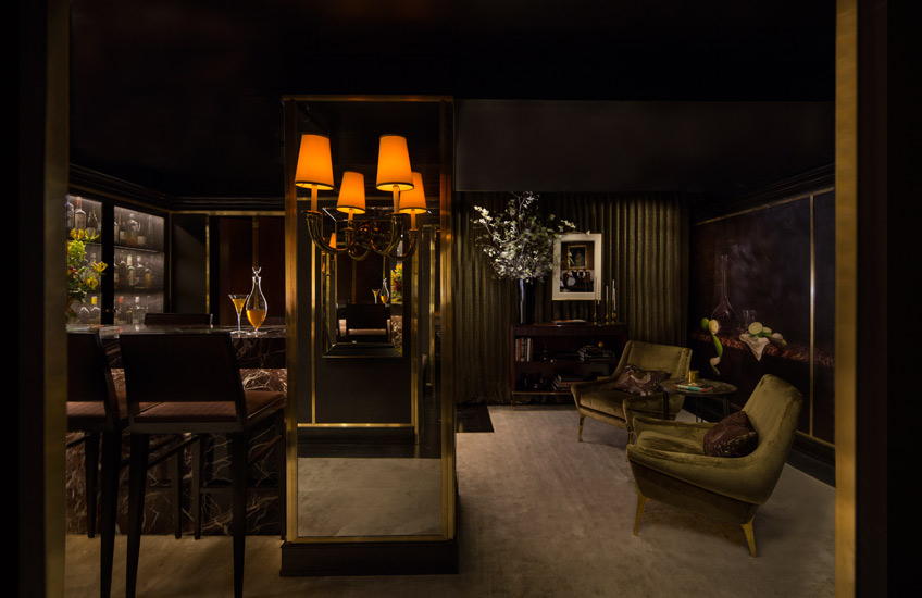
Lounge & Bar by Lichten Craig Architecture & Interiors: SEXY and brilliant in this tiny space. Hard to photograph…you had to be there. Rock stars this team.
Stairway by Savage: Be still our heart.
Master bedroom by Dineen Architecture. Uber-cool, metropolitan and sexy. Made you want to either put on sexy lingerie, or peel it off.
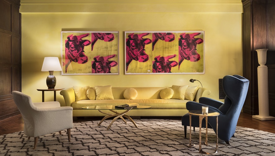
Robert A.M. Stern’s Living Room. Katie’s favorite…whoever said yellow was dead was lying.
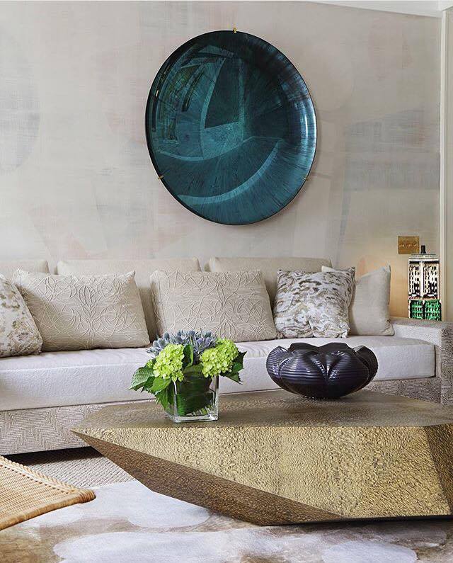
Kristen & Kelli Living Room: Bold, confident and lots for the eye to take in but it all worked.
