I can think of very few places where amazing interior design ideas abound, but making the shortlist is absolutely the Kips Bay Show House. This year, the great-design-ideas fountain overflowed!
Read on to learn some great interior design hacks based upon my recent trip to the 2018 Kips Bay Show House. You’ll glean some delish tactics to use for decorating a small living room, designing a small bath, plus great design hacks for making big splashes on tight budgets.
Here are some fav space shout outs and the hacks & tips you can glean. Review the image and its description, and then immediately following, you’ll see the design hack translation.
Enjoy, my lovely design lover!
Kips Bay 2018 Takeaways Design Hacks:
Hack #1:
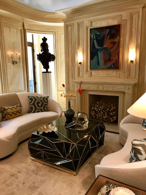
This smashing living room by Bunny Williams boasts kidney sofas, a vintage cocktail table, and hand painted (yes) walls that look like wood…a technique called faux bois.
Here’s your takeaway…
Interior Design Hacks for Small Living Rooms:
- Minimize the number of colors used in the room and keep them lighter and the room will look larger
- You don’t need a million end tables: A single large cocktail table grounds this grouping….so….
- Fewer pieces of furniture that are themselves well-weighted makes a small living room space dramatic while keeping it feeling open.
- Ditto on accessories
- Have at it with pillows!
++++++++++++++++++++++++++++++++
Hack #2
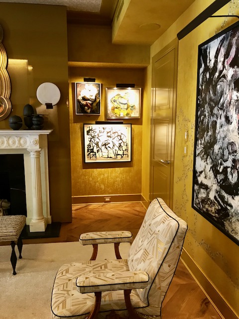
Detail shot of the living room by rock star Jamie Drake of Drake Anderson boasts fabric covered walls which also have hand applied painted accents, a midcentury modern contrast piped accent chair, a textured rug, herringbone wood floors, classically treated fireplace millwork, and modern art.
What’s your takeaway?
Interior Design Hacks for Art with Impact
Ok, so this this room boasts some pretty pricey artwork! BUT….you can
- Deliberately unify your artwork color to your room color story and massively up the ‘high end’ factor
- Add art lights over your artwork. Why not purchase art from My Big Canvas (am I making up that website name?? Just google it!), do a few good sized pieces and yes, add an art light above. The art will look 10X more expensive.
- The bigger the art, the more impactful it is. You have no idea how many rooms in this show house boasted a substantially sized piece. Again…it doesn’t have to be pricey…but treat yourself to a large art piece in a dining room or living room or foyer or family room…Mmm, Mmm, Mmm.
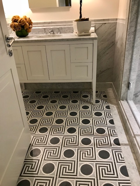
This small bathroom by Mark D. Sikes boasts geometric tile floor bordered in marble, marble dado, recessed panel cabinetry without hardware (push latch to open), and asimple marble counter and backsplash. What does this mean for you?
Design Hacks for Small Bathrooms
- Add drama to a small bath by going bold and vibrant on the floor. But if you do…
- Keep the rest of the bath “quiet” with both colors and patterns so that your one big flourish really shines.
- Small baths don’t require a ton of flooring material, so step out with something really special for big impact and let the walls whisper instead.
- You don’t HAVE to do hardware on your cabinetry. You can do push latch for a clean, fresh look.
- If budget allows, consider doing stone on the walls up to the chair rail. It’s a million dollar look, and once again, in a small bath, you don’t need a ton…of anything.
- Keep accessories to a select minimum! 1-2 mid-to large size items are better than 3-4 mini’s.
+++++++++++++++++++++++++++++++++++++++++++++++++
Hack #3
Interior Design Hacks for Making A Big Splash on a Tight Budget:
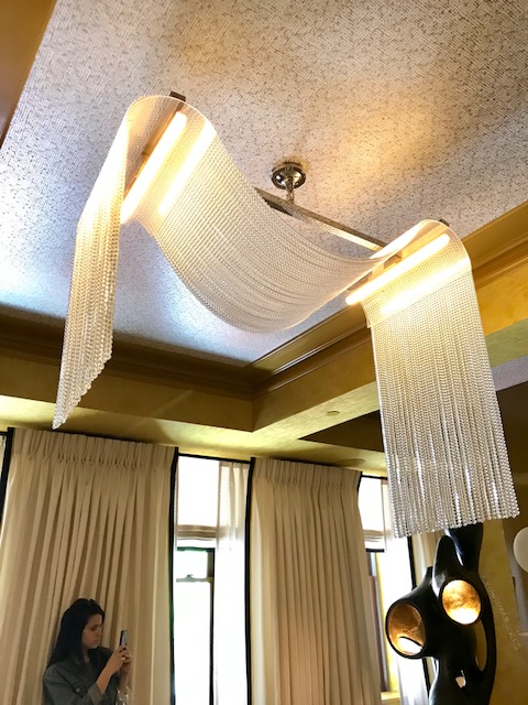
Detail shot of Jamie Drake’s living room showing …well…Katie getting her own detail shot! But also, note the wallpapered ceiling. (One among a zillion treated ceilings at this year’s show…how do you spell…incoming trend??) Also note the curvy light fixture that just drips off the ceiling, the curvy sculpture, and the clean, linear banding on the window drapery panels.
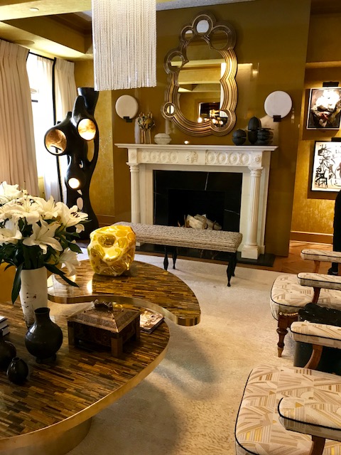
Another view of a room by Jamie’s firm, Drake Anderson. Notice the curved retro coffee table, pair of accent chairs with distinctly rounded arms, round sconces, rounded gold mirror and sculpture. Does this room just “drip” with images of molten gold, just dripping and oozing?? Uh! SO exciting…but I digress…just notice those details I just mentioned and we’ll come back to some hacks for you!
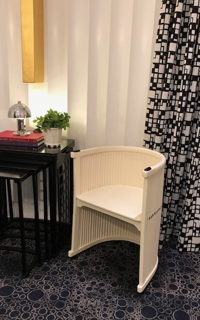
Detail shot of Juan Montoya’s work boasts modern scalloped millwork wall, petite barrel chair featuring tiny scalloped detailing, circular patterned carpet, and a small geometric drapery panel.
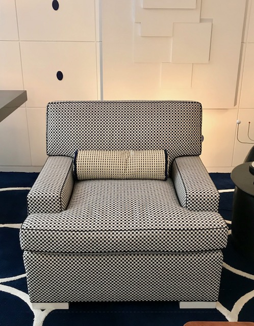
Detail shot of Juan Montoya’s lower level living room shows contrast piping (or welt) on the tiny square check fabric covered club chair and tiny check bolster pillow with contrast welt. Also shown is the modern wall millwork detailing: applied square panels with applied oval medallions, along with a geometric mixed media art piece and, a little hard to see, but there it is…tight shot of a large scale circular patterned rug.
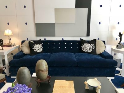
Detail shot of Juan Montoya’s living room shows…well, so much! But for now, I’d like you to focus only on those wonderful contrast tufted buttons on this sofa. (I covered the millwork and art in the caption above).
So, what do these random thought images have to do with great design hacks for you – especially if you’re working on a budget, which we know…these designers are not. ☺ Read on:
Interior Design Hacks for Making A Big Splash on a Tight Budget:
- Wallpaper a ceiling. Oh My Design Goddess…always a “wow” in a room. Now, I didn’t say …do it in every room, but pick your star and winner. Try it in your dining room or powder room, or living room, or bedroom. You don’t need as much as doing all your walls after all!
- Hack this hack: Don’t want to do the entire ceiling? Create a picture framed molding rectangle or square on the ceiling that is about 2/3’s of the whole ceiling and paper only inside this area (See Jamie Drake Room Image Above as just one of the examples from this year’s house showing papered ceilings).
- Repeat room element shape: Juan Montoya repeated the millwork shape of his walls in that cute white tub chair and in his lower level living room. Jamie Drake had curves abounding in his golden room. Find a shape in your room and riff on it with the fabric and rug patterns, furniture shapes, accessory shapes, light fixture shapes. Go for 70/30 or 80/20 balance….as in 70% rounded 30%linear.
- (See Jamie Drake’s Golden Room image and Juan Montoya’s detail shot images above for examples of this hack from this year’s show)
- Add contrast piping to a chair, or pillow. It doesn’t’ generally amount to a big upcharge, and sometimes, no upcharge at all, and the look is tailored, crisp, and exciting.
- Hack this hack: OR….for the truly brave and wonderful…do contrast buttons on your next tufted purchase: )
- (See detail shots of Juan Montoya’s chair and pillow with contrast welt, and the detail shot of his navy sofa with contrast buttons.)
Is there a TON more to say about the 2018 Kips Bay Show House? Oh. My. Goodness…YES! Do not even get me started!
If you’d love to know beyond these delish hack lessons above, then you do not want to miss my Kips Bay 2018 Trend Report that I posted in our other delish design blog. Click here to read all about the 2018 Design Trend Report, and by all means, feel free to sign up to both of our blogs!
Xo! D


