As a luxury interior designer as well as a design coach to women across the US and beyond, whenever I do the annual jaunt to my happy place…NYC’s annual Kips Bay Show House, I always experience the show with 2 sets of eyes.
On the one hand, for the pure love of the fine art of design, I soak it all in, enjoying the inspiration that comes for my own clients and projects.
But with another set of eyes, as I delight in the design that rolls out before me, I can’t help but notice some wonderful lessons and even some quick design hacks that my students can enjoy in their own homes right away.
The 2019 Kips Bay Showhouse, this year in NYC’s ever-posh Upper East Side proved to be the usual expected delight.
Those of you who know me, know that I often wish I could take each of you through the house with me on a tour so I could do some on-the-spot teaching and coaching. Can you imagine how fun that would be?!? 😊
BUT, since there are thousands of you and only one of me, and though large…even the $17M Manhattan townhouse for this year’s show can only hold so many people at one time!
Since I can’t take you with me, let me give you 5 design lessons, hacks, tips and takeaways from this year’s Kips Bay Showhouse.
Lighting as art.
Make any room more striking, even the most routine room, by adding an overhead fixture that has some “wow” factor. Nearly every single designer in this showhouse did just that. You can too!
Regardless of budget, search for something great, something different, something striking and you’ll elevate any room.
Bigger lesson: Don’t make your light fixture an after thought. It has a HUGE impact on any room.
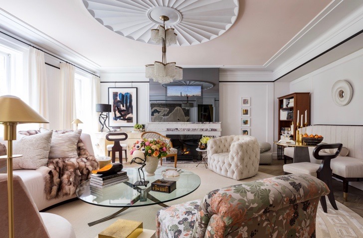
Ceiling treatment.
One of the things I always love about the Kips Bay designers is that they almost ALWAYS ornament their ceilings, choosing from design devices ranging from millwork, to paint, to lacquers, to color, to banding, to wallpaper.
The list is endless but don’t let it, or budget, intimidate you!
Take a nothing-special boxy bedroom (like we all have) and wash the ceiling in a color! Amp up your home office by adding a high-gloss lacquer to your ceiling. (And a great light fixture, girlfriend…did ya read item #1?). Wallpaper the ceiling in your powder room or walk in closet! Ah!
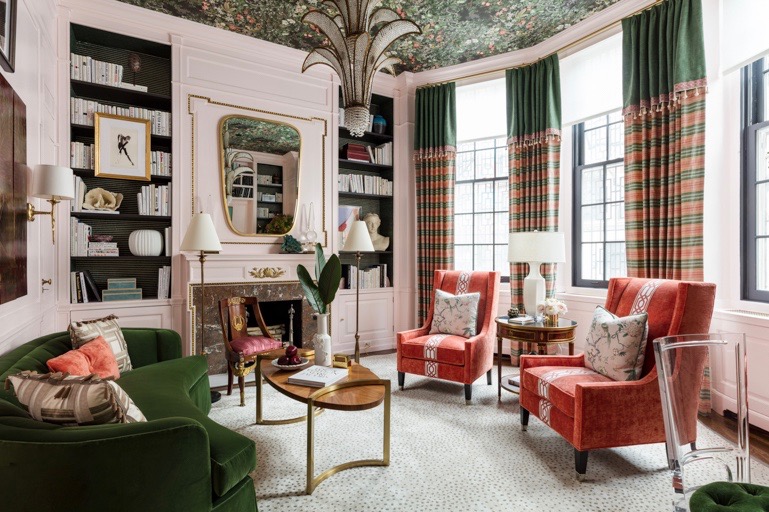
Corey Damen Jenkins and Associates, LLC
Mix just 1 antique with modern design elements.
Kips Bay designers do this and they get an amazing punch.
NO, I don’t mean your 1990’s dining room china cabinet. That bad boy had its day and needs a refresh. I’m talking about the really cool old chair that was in your grandmother’s house, or your uncle’s old desk from the 1930’s. Or your great grandmother’s dining table. Or the antique accent chair you and your hubs found at a flea market and had reupholstered.
Span a century or 2 in design periods and expect great results.
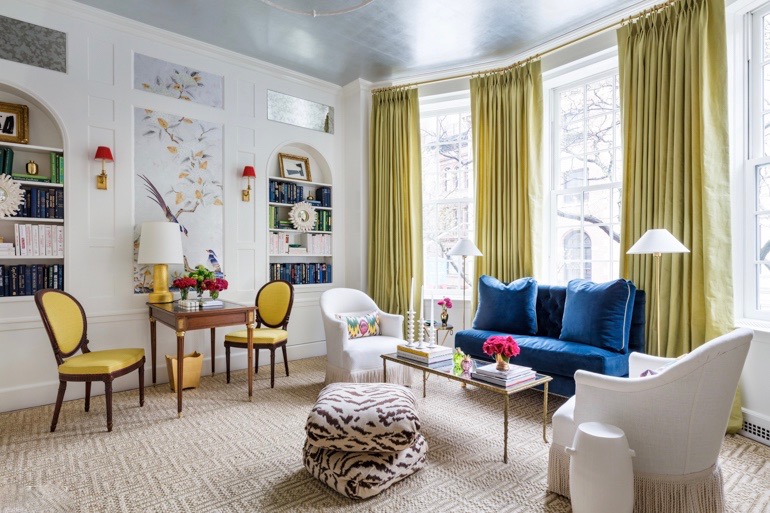
Paloma Contreras
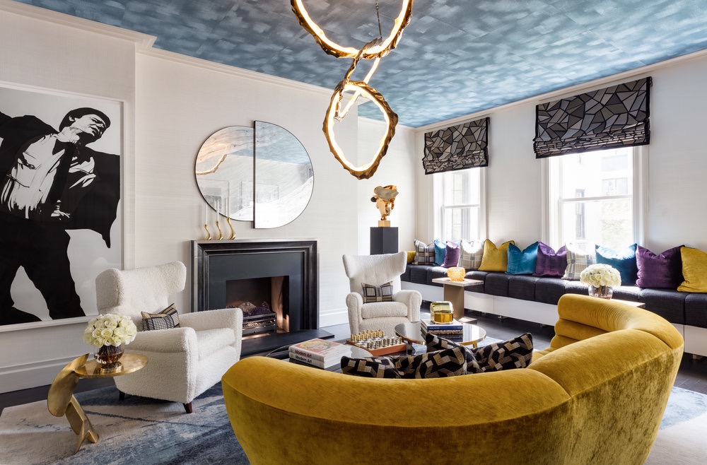
Saturate a color.
OK, so I’m getting into some trending here, but stick with me for a sec.
If you want to add an instantly striking note to any room, particularly in a sea of neutrals (gray, beige, cream), add a strategic pop of a deep, intensely hued color: an emerald green, a deep peacock blue, a vibrant goldenrod.
Not a sweet, screaming, too-bright color. Not a light color. Try a deep, rich hue like the ones noted above on a chair, on a few pillows, in a few accessories. Be sure to keep your undertones in the same family as the rest of your room palette and the effect will be, well….let’s just say, your room will thank you. And…you’re welcome too BTW. Xo.
Layer textures
Kips Designers excel at this and it’s always a home run.
OK, so I’d like you to look around your room, right now. How many varied textures to you have between ALL the furnishings: flooring, upholstery, fabrics, wood furniture, art, counter if applicable!
Your choices are: smooth, rough, shiny/reflective, soft, fluffy, matte.
Tally it up, and then, add in just one dose of something “else”.
Here in my restful design studio for example, I have a good mix of matte (Floor covering, fabrics, cabinetry, a hand painted acrylic Liz Taylor painting (that I love!); then there’s the shiny: a splash of glass cabinetry, windows of course and a glass desk top.
But the studio sang when I added a FLUFFY llama rug throw over the back of my desk chair.
Get where I’m going here? Look at the dominant textures in the room…and then add something different, something more. That nuance always, always, always pays great dividends.
Use any of these devices that I noted from the 2019 Kips Bay Show House and watch your own design results head to that next level. Bam. So easy. Sooo good!
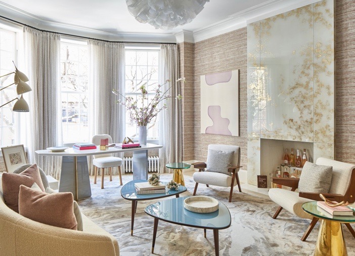
Eve Robinson Associates


