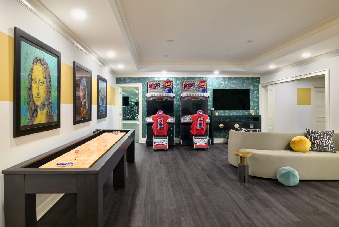
One of the greatest slight-of-hand-tricks a good interior designer can do is to use design strategically in order to make any room “look” (and feel) bigger than it is. Small spaces can be vastly improved using various time-tested design moves. Here are 5 favorites that can be easily put into action by anyone – some at zero cost!
LIGHTING
Natural light is, and always will be, your best friend to drive a sense of spaciousness in a room. Having large windows also helps to create the illusion your room extends outwards. To make the most of this, try pulling back your drapes or rolling up your shades. Try not to put items at the window sill for several reasons, not the least of which is that this stops the eye before the expansive-feeling view.

On the other hand, not every room has an abundance of natural light. If you’re in that camp, bump up the lighting by adding some combination of lamps, ceiling light fixtures, and even recessed lighting (which you can always install as dimmable.)
HAVE ONE FOCAL POINT
Architecture drives the room’s focal point. Be sure your furniture arrangement is in alignment with the focal point. If you’re working with a room that lacks a special architectural feature, such as a secondary bedroom, instead lean into the purpose of the room as the obvious indicator as to which piece of furniture will become the focal point…ie, the bed! Having only one focal point is always easier on the eye, and space expanding.

DECLUTTER
Want a zero-cost maneuver to open up a room? It’s time to declutter that space! Clutter is a “spatial killer”. It stops the eye, creates visual “static” and truly closes a room. As I tap this, our daughter is out of town with her boyfriend visiting his family. She reported via text that his room is “not comfortable to stay in because there is ‘so much stuff’, everywhere and on every surface. The lesson? Want more space? Declutter! Zero cost and big payoff.
REFLECT THE SPACE
Mirrors reflect both natural and artificial light, making them a great accessory to create the illusion of a larger space. Unless you’ve been living in a cave for the last few years, no doubt you’ve read this “add a mirror to a room” trick before. We include here because…it happens to be TRUE! Think one large standing mirror, think a grid of six or 9 framed 14”-16” mirrors. Think of one great starburst mirror. Think of one custom framed mirror hung above a sideboard. Mirrors are room expanding power tools.
PICK THE RIGHT COLORS
Creating a larger-feeling room is all about creating an optical illusion. Splashing lighter toned paint colors or wallpaper can make a room look bigger and brighter due to the receding effect they have. Lighter colors appear to move away from the eye and in so doing – they make spaces look bigger. We just had a client repaint their first floor using lighter, receding wall colors to update the darker and warmer “advancing” wall colors they had previously. The first text we got while the painters were working was “Oh my gosh…it looks giant in here!”
Mic drop.
If you’d love to develop your ability to truly rock your interior design in ways you never thought possible, you’re officially invited to check out our online course, The Decorating Genius System (DGS). This class, which runs about the length of a good movie (!) (Less than 2.5 hours!) is incredible AND incredibly effective. The results my Design Lovers get are truly amazing – spanning all design styles and budgets. Click here for more information.


