If you love to design a monochromatic space — maybe you’ve never done it before or maybe you want to do it better this time — let me tell you what the pros know about making monochromatic spaces fabulous. I’m going to be sharing those key considerations with you in this video.
If you want to create a great monochromatic space, it’s easier and harder than you think. Let’s start by defining our terms. A monochromatic space is one that uses mono, one color as the color running through the space. You can make that color darker, you can make that color lighter but that’s a single color. You can have red monochromatic space where the room is red. Or green monochromatic space where the room is done in various shades of green and then it’s cut with a neutral. Or you can do a totally colorless space, meaning it’s all done in neutral. That’s your monochromatic space.
Texture & Form
So if you want to tackle a monochromatic room and make it fabulous, the thing that gets harder about monochromatic spaces is that texture and form become the most important consideration. What do I mean by that? Define our terms, texture means the visual feeling of something. Texture can be mat, visually, or shiny, visually. It can be stone, glass, and mirror. It can be fluffy and fuzzy. It can be hard and smooth. Texture is a visual thing in design, not just the tactile thing. With the monochromatic palette, you want to make sure you’re paying a lot of attention to texture and are trying to layer in as many textures as you can to keep the space interesting.
Shape & Line
The second consideration that’s very important with monochromatic design is silhouette, and by silhouette, I mean shape. When you go to a single color room, a monochromatic room, whether it’s done in all neutrals or all in a single color, the shape of things becomes so important. It really moves forward. What do I mean by that? I mean literally the outline, as if you were to draw something. The outline of the sofa. The outline of the tables. Everything just counts more, it moves forward more, because your eye is nothing as distracted by lots and lots of different colors. Your eye is seeing a single color so it is looking for differences and changes.

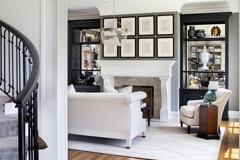
Let’s take a look at an example of a fairly monochromatic space. It’s got this gorgeous cream palette, lots and lots of cream in this room: the rug, the upholstery, creams, and whites on the ceiling, on the millwork, on the drapery, and then you got a cut with a little bit of neutral, that lovely gray wall and a little bit of black in those bookcases.

Let’s talk about shape. Notice how strongly shape is moving forward and the differences in the different shapes. The beautiful curves of the sofa, beautifully contrasted by the clean, strong lines of that gallery grid artwork, in contrast to that, you got this wonderful semi-circle in that beautiful, blingy light fixture. In contrast to that curve, all the straight lines in those bookcases. Contrasting that, the fireplace is a nice mix of curve and straight.
Look at that wonderful side arm table. It’s an octagonal shape. Is that a mistake or is that an accident? No, that’s done by intent because when you work in a monochromatic space, altering shape becomes really important.
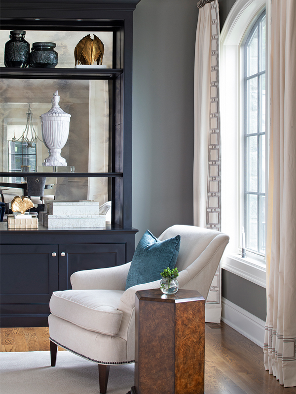
Take a look at this next image. It’s a closer view. In this next image, you see in this room a beautiful variance in textures. You see everything from shine in the mirrors at the back of those bookcases, to mat on the upholstery, to a bit of shine on that sidearm table, to a nice mat texture on the stone around that fireplace.
In this next image, you’ll see even more texture being shown. You see the glass front on that gallery grid, adding more shine to the space. The metal screen in front of the fireplace has a reason it was not done in a shine, adding mat texture against the shine in a room. The bling of that light fixture, the velvet pillows in that soft teal color. Flipping between mat and shines, soft, fluffy, clean lines against curved lines. That’s what makes these interiors really exciting when you’re dealing with monochromatic spaces.
To wrap it all up, monochromatic spaces require a little more attention, paying attention to line, form or shape, and texture. Do that and you have a gorgeous monochromatic space in your home.


