I wear a lot of design hats: I’m a professional interior designer and a luxury design business owner. I’m an interior design consultant. Beyond serving private design clients, I’m also an entrusted interior design teacher and a design coach to Design Lovers across the globe who are working on their own homes – women not hiring designers.
And yes – I love them all!
As a trusted design guide, spotting interior design trends is an important responsibility –and until recently, I didn’t know that trend spotting doesn’t come naturally to all designers.
I stumbled on this realization after traveling with a group of talented designers to a major international design trade show. One morning at breakfast, we excitedly discussed what we had seen at the show the prior day, before returning yet again for a second day. As I talked about the trends I had spotted, a few designers in our group looked at me blankly. Then, they asked me if I could please tell them the trends I was seeing because they just DIDN’T see them. Couldn’t see them.
Luckily, I’ve always had this odd-duck, equally-strong, left brain AND right brain orientation, which as it turns out, makes trend spotting for me as natural as blinking.
So here for you my lovely, since our trend reports are always spot on, please enjoy this look inside the wonderful AD Paris Intereurs 2018 Show House. Translated, that’s the wonderful Architectural Digest Paris Interiors Show House for 2018.
Setting the Stage:
This year’s house earned its place as one of the best show houses I’ve attended. Ever.
The admirable design talent aside, it didn’t hurt that the show house took place in a building dating back to roughly 1735. Originally a medical school, then a government building, and is now being rehabbed into office space. It’s literally under construction. Right now.
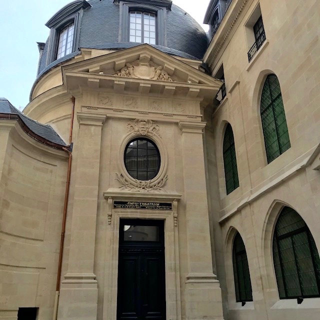
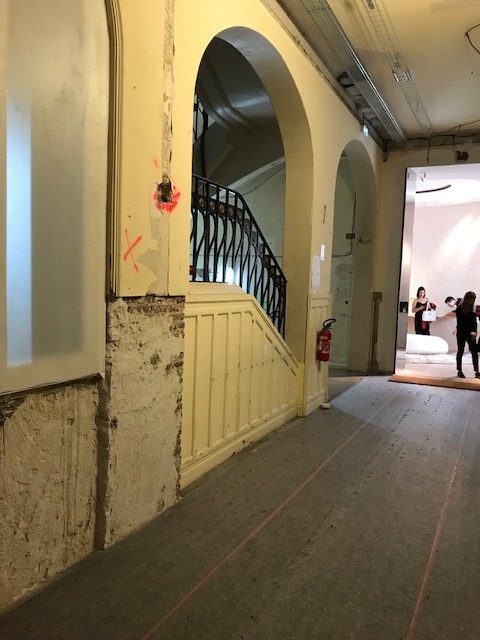
As a result, an exquisite show house took place inside a building that’s being rehabbed! The experience required you to walk through hallways containing exposed electrical wiring and HVAC, or stairways punctuated with crumbling dry wall and scrawled graffiti. SO fabulous because…
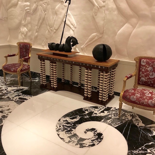
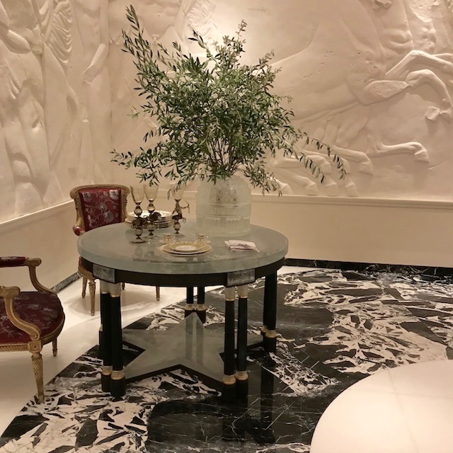
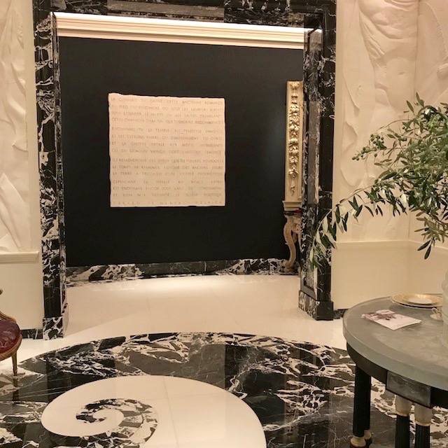
Imagine stepping through this controlled-renovation chaos and slight decay into an exquisitely polished and appointed room, fitted with a finely inlayed black and white marble floor swirling better than an escargot shell, and combined with figure embossed plastered walls and the finest of furnishings, fabrics and art.
Step out of that salon and travel back through the building’s chaos in order to enter the next room: a sleekly modern salon dripping in custom woven carpet, upholstered walls, twin custom sofas, collectable art and sleek mid-century furnishings and lighting.
On it went. We’d weave from renovation debris to breathtaking design. Renovation became the beautiful frame.
#Swoon!
#Wishyoucouldabeenthere!
The Trends:
I’ll share photo examples throughout and after this trend section, but the “CliffsNotes” version of the AD Interiors Paris 2018 show house trends are as follows:
Color: The clear new story was rich Olive Green and Goldenrod Yellow. Gray, though mildly present, took a back seat to Cream and off-White, which were the much larger story. These paired beautifully with Olive and Goldenrod and kept them bright and fresh. So did Black which was notably on the scene, in both fabric and hard finishes. Navy continued to have its moment. Red & Orange were barely present. Purple was a no-show, as was Turquoise.
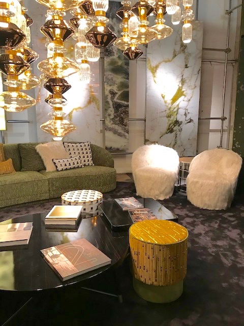
Metals: Metals remained golden and warm, with brushed finishes still on the scene, but high polishes coming in. A return to the 90’s? Nope. This bright Gold was warmer than that of the past. Silver lovers, fear not. Silver was still there, but Gold is still the bigger story.
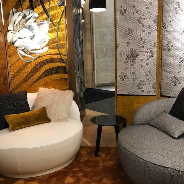
Upholstery Shapes: Sofas and chairs got rounder and in some cases….more overblown. Kidney shapes were definitely present, and when they were not, upholstery had rounded arms and shoulders and was paired in deliciously sharp contrast to accent upholstery with severe square shapes. English arms and sock arms didn’t make it to this party.
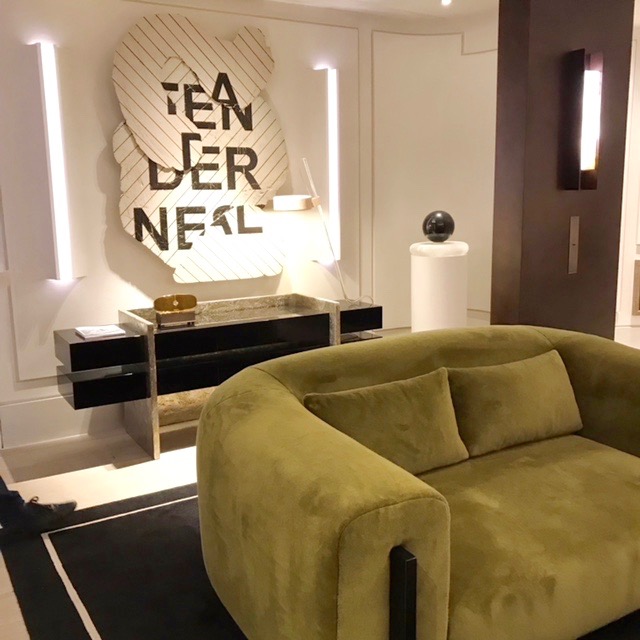
Wood Furniture (Casegoods): Lines were clean and crisp. Shapes were either classic, mid-century modern or 60’s and 70’s retro. Like New York’s 2018 Kips Bay show house, antiques as accent furniture and contrasting foils to their modern brethren were present as well. Finishes ranged from polished stones to low luster lacquers, to blonde and mid-tone woods.
Style: Not a whiff of Rustic or Farm House could be felt (Hey! This is Paris!). Also absent: Farm House Glam and of course California Casual. The overarching interior style, while eclectic, leaned toward sleek, cosmopolitan classic with a hint of mid-century modern or 70’s retro: Perfect for a pied-à-terre in Paris, LA, New York or Philadelphia’s Rittenhouse Square.
Some designers pushed into overblown recreations of 80’s glam that had Hollywood Glam roots; others pushed into modern minimalist that had you begging for a comfortable place to sit.
Themes:
Treated walls: From richly upholstered walls in embroidered faux suedes or silks, to pieced silk mattelassés, to plaster walls with retrofitted lighting, to embossed plaster walls with human scale male figures that would make any Greek statue envious.
Show House Notes: Only The French!
There are distinct differences between this show house and those in the US.
For one thing, in the US, designers scramble madly for 6-7 insomnia-fueled weeks to get their show house projects designed and delivered. For the AD Intereurs 2018 Show House however, a designer shared with me that that they’d had a glorious full year. (Jealous!)
Here’s a huge point of difference: Visit a show house in the US and you’ll see a variety of fully inhabitable rooms. Even if a room’s “style” isn’t “your thing,” you can still imagine people living in it. But in France, the same heady country that gave us thinkers like Voltaire and Sartre – not so Joe!
Certainly, many of the stunning rooms in this year’s AD Intereurs show house were finely appointed and allowed anyone with deep pockets and a stunning sense of style to put up their “I Could Live Here” sign. However, unlike the show houses in the US, in the AD Paris show house, there were also those truly French design “show house rooms” that were more like avant gardé statements about design, or about the way we live today, or about who we have become. Like little slices of theater of the absurd, you looked at a “salon” and thought 3 things at the same time: “Wow, this is SO great”, “What the hell does this mean?” and “How do you sit??”
You’ve GOT to love the French. Not just because they helped us win our revolution in 1776. But also because they are so devilishly and deliciously…FRENCH.
Show House Honors:
There are too many favs for me to call out each one but here goes for a few:
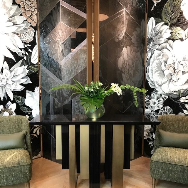
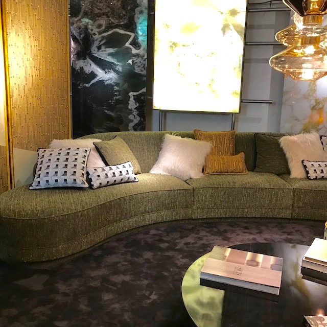
Le Lounge Sicis: Voila and bravo on this oversized entry and entertaining space: Olive, Golden Rod and Black upholstery; Art Deco meets Rhule. Custom Screens in upholstery and tile were showstoppers. 3 room views shown below:

 La Salle A Manager (Dining Room J ) by Juan Pablo Molyneux. This stunner boasts a marble inlay floor, a neoclassical dining table, custom embossed plaster walls, and fine collectable antique furniture and art. Not exactly ready to seat a giant dinner party, but honestly – who cares? SO beautiful so I’m giving him a pass.

La Chambre de Play-boy. (Gentleman’s Bedroom – or – Sexy Guy’s Lair). A true stunner, this bedroom boasted hand painted wallpaper, hand sequined drapery in the room’s rich Blue palette and Italian case goods. To best sum up this sensual bedroom let’s say this: The answer to whatever question “he” could ask you would easily invite the answer “yes” and involve nudity. 3 images shown below:
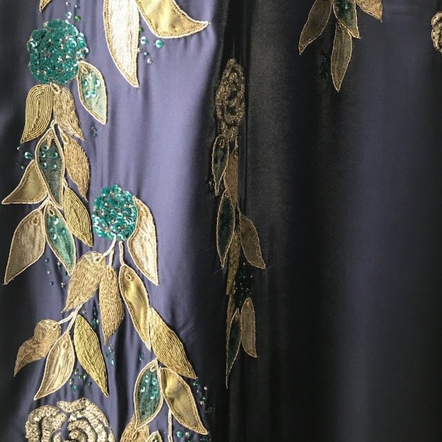
(Detail shot shows the custom embroidered silk window treatment fabric. Note the sequined flowers. THIS is why you’d hope this guy calls the next day….)
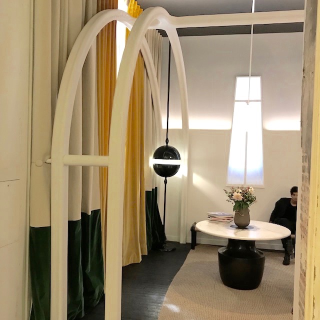
Le Cabinet de lecture: (Home Office) by Éric Schmitt. This statement room is worth a look. It was dominated by custom arches and the fireplace that consisted of a looped video of fire with feet IN the fireplace. Cold and austere, the room was less about comfort and function and more a statement that our work has become our religion and our feet are to the fire. High marks for interesting. And clearly a talented designer. Not so hot for creating a comfortable space to sit and write a blog post like this.
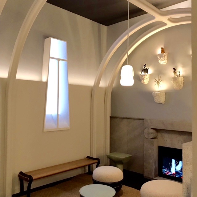
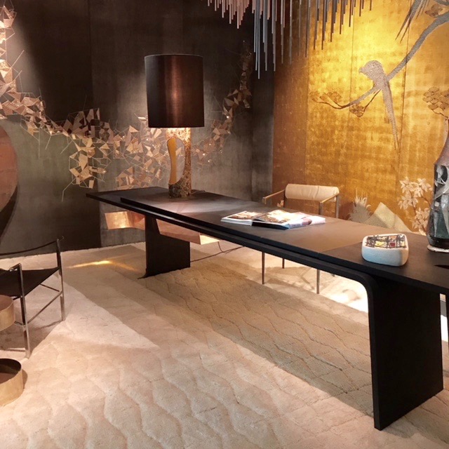
Le Bureau precieux (Home Office) by Thierry Lemaire. First let me say: Too bad Thierry got the “small desk.” J This room boasted a massive custom desk that dominated the luxe space, with walls upholstered in embroidered and pieced suede. Stunningly original and perfect for the right minimalist worker.

The Salon de Meditation (Make this one a Living Room) Wonderful custom upholstered shapes sit on top of an exciting ombre rug in a room whose restful palette of cream and pale blue and retro furnishings and lighting, would inspire you to say “ohm”… in French.
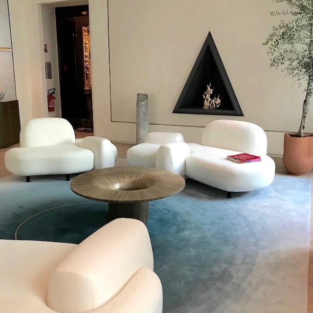
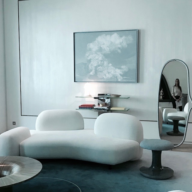
(Detail shot shows upholstered wall inset – and my accidently-caught daughter’s reflection in the custom mirror as she looked wondrously at this captivating space).
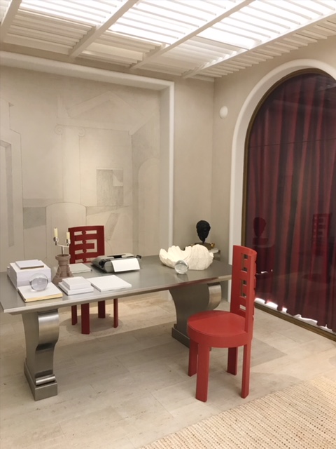
L’antichambre du’un dandy (another office!) by Lecoadic Scotto. OK, so this statement room got my attention also, hence its appearance in this post. On one end of the room, there is a somewhat severe, though workable desk with uncomfortable seating. At the other end –instead of a fireplace – we have an austere alter. To what? Precisely. I have no idea. Really interesting. Perhaps a statement that our harsh work life has been elevated to the religious. Depressing? Cool? Either way, very interesting!
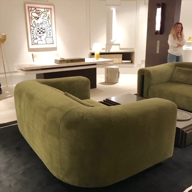
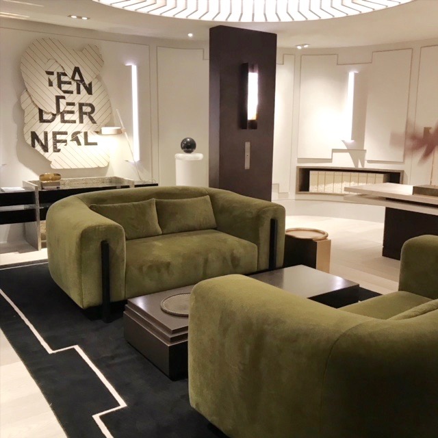
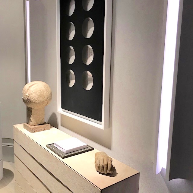
Le Bureau de Repose. (The chamber of rest….let’s call this one the restful family room.) by Stéphane Parmentier. This great space was a show house favorite for many reasons. It was a perfect mix of luxury detailing and livable comfort. Twin custom Olive sofas, with an extremely grand proportion sat neatly inside a custom rug whose border defines and follows the placement of the furniture. (A wonderful flourish requiring painstaking design control.) A mix of contemporary and mid-century modern furnishings rounded out the mix. Plastered walls were embedded with sconce lighting. A truly memorable space that boasted a great use of the newer color Olive on the scene.
Other images below include:
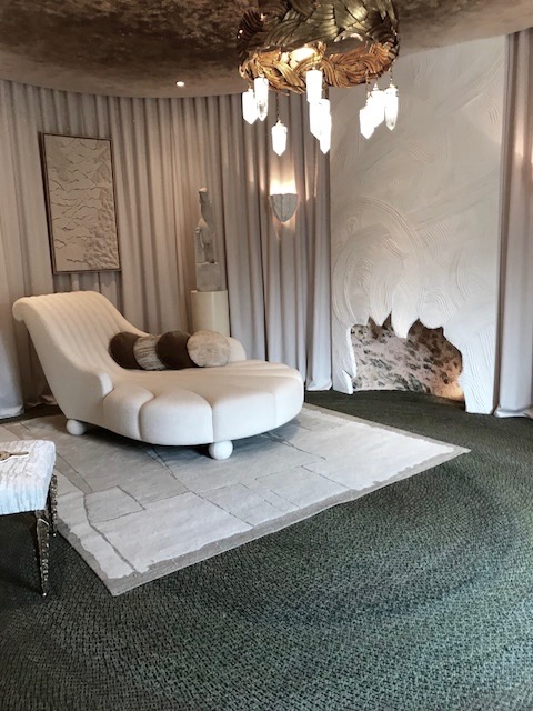
The Chambre Couture – by Anne-Sophie Palleret. An intriguing sitting room with an over-sized almost cartoon-ishly scaled chaise, draped Cream walls and an artfully indicated fireplace.
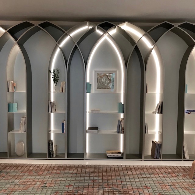
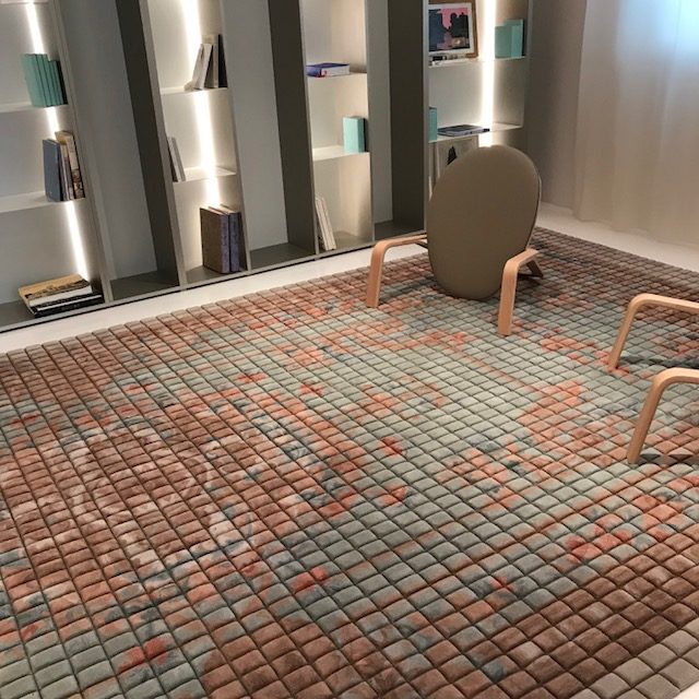
La biblioteque boheme – or library by Fabrizio Casiraghi. A large wall of eye-candy-beautiful, modern arched bookcases, were strikingly back lit and inset. They were also outfitted to hold a scant few books. The double padded carpet was a plush necessity. Since the chairs had no seats, boasting seat backs and arms only, the rug is also your seat. With a bare few books in the room, and no real chairs, your plan when spending time in here is to sit on the floor and bring your Kindle. Or just say, “screw it” and go to Starbucks to sit and read a book in peace, and in a chair.
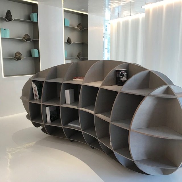
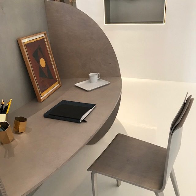
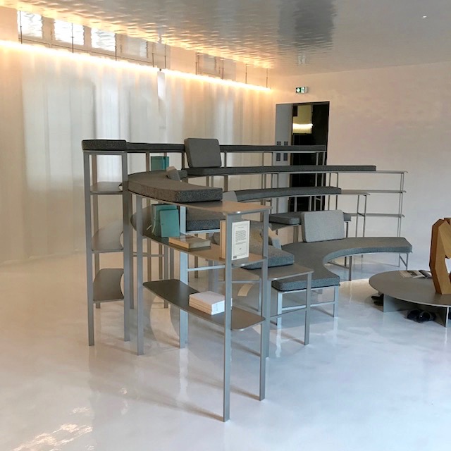
Le Bureau des Philanthropes – by Remy Fishler. I will award 2 points for ingenuity and creativity here. In one kidney shaped piece of furniture, we have shelved storage on one side, with an inset desk on the other, and topped off with an equally interesting peeling chair. This imagined space had no walls so fabric was used instead to indicate them. I’m thinking the adjoining “media viewing” area was part of this “room.” My only thoughts on this media “room” is that the seating would require knee pads and a bike helmet. Otherwise, there will be endless homeowner’s insurance claims for broken bones incurred by the people attempting to use this stadium seating. A good movie to watch from this space would likely be a documentary about the dangers of Parisian media room seating.
