So, you’ve updated your home, invested in some new furniture and installed beautiful window treatments and now it’s time to add the finishing touches. As you embark on your final quest to accessorize, we are here to ensure that your fabulous design train doesn’t derail as you are approaching the light at the end of the tunnel! Read on, and avoid the Top 3 Home Accessory Blunders!
1. SCALE:
Choosing items that are size appropriate for the area they are assigned to is of utmost importance. Have you ever entered a room, only to be visually assaulted by an oversized candelabra or imposing sculpture? We have also, yet no one wants to discuss the proverbial or actual “elephant in the room”!
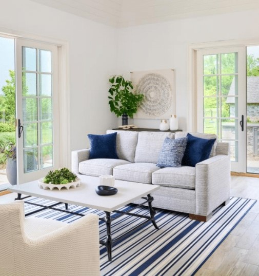
When choosing an accessory, a good rule of thumb is to use the rule of thirds. For example, take a look at your coffee table. Mentally divide the top into 3 equal sections. You do not want one accessory to have a footprint of more than 1/3 of that tabletop! Stack some books, layer in a small catch-all bowl or two, add in a few small items of interest, such as a small sculpture or figurine and you are good to go!
Want a great example of how to play with scale? Check out the photo below for some fantastic inspiration!

2. TOO MUCH VS. TOO LITTLE
As with anything in life, finding the happy medium regarding how many accessories you use, is crucial. The space itself will guide you. What kind of décor are you accessorizing? Is it a maximalist décor that demands layers upon layers? If so, you will want to follow suit when selecting your accessories!
Is it a minimalist décor that takes a, “less is more”, approach? Again, follow that same line of thinking and resist the urge to overdo it!
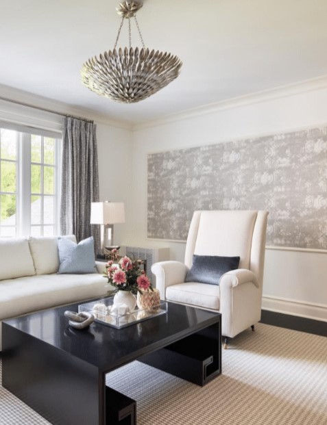
A bonus tip is to make certain that you have enough statement pieces. As the name implies, these aren’t going to be your run-of-the-mill tchotchkes! Select a few statement pieces that will drive the surrounding items and will act as the “filler” to complement and complete the look.
Put it into practice! Identify the statement piece below and notice how the designer artfully complimented that piece with smaller filler pieces, with impeccable results!

3. DON’T SIMPLY COLLECT: CURATE!
One of the most common accessorizing faux pas stems from our societal need for instant gratification. We want it done NOW! This often pressures designers to swoop into a few stores on any given Saturday, fill the car with bags and VOILA – “DONE!” We advise against this strategy, simply because the lack of thought and time will become very evident in the final outcome.
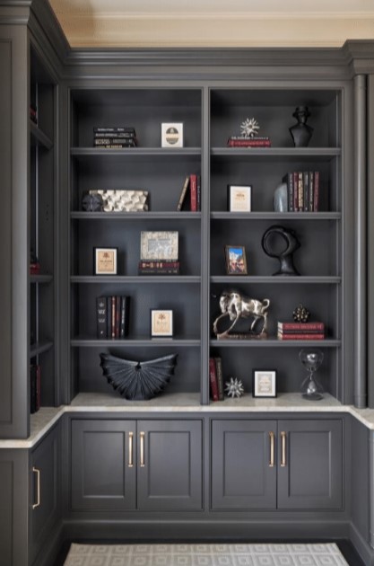
Take your time! The worst thing you can do is become too “matchy-matchy”. Stores will often have a similar “look” to their items — that is key when curating and staging displays. Common themes are great for a small boutique, however, when one purchases a large portion of their accessories all from the same source, the look loses interest. Allow time and space for stumbling across the perfect treasures that will appear when you least expect it! Be playful! Look for juxtaposition among your selections – this will add dimension and interest, resulting in a much more thoughtful and curated aesthetic.
As you can see in the accessories chosen below, colors were kept in common, but the silhouettes kept it interesting!

If selecting accessories is a challenge that you’re wrestling with, you MUST check out my online course Design CPR…Creating Perfect Rooms with Accessories. It’s a true game changer online course that design lovers…LOVE! You can learn more by clicking this link.


