As a designer with over 15 years in the business, never ONCE have I heard, “I love what you are doing, but is there any way that we can pour MORE money into this project?” We have all felt the uptick in pricing these last few years, due to a spike in inflation; everything from gas to groceries costing significantly more than recent years. That being said, when it comes to interiors, who wouldn’t want some tips to get more aesthetic bang for their buck???
Read on for our top 3 Tips on How to Make Any Room Look More Expensive!
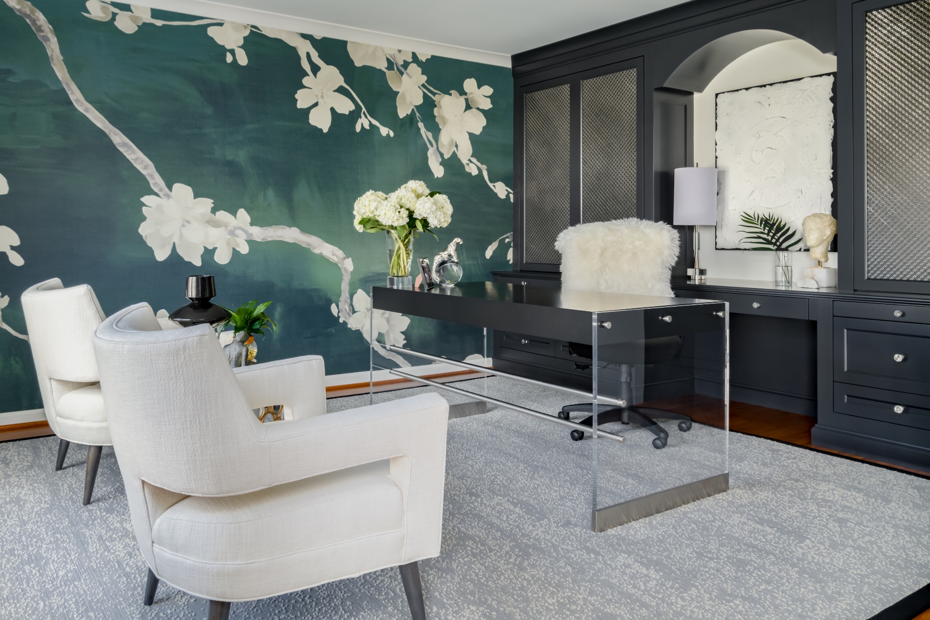
Tip 1: WALLPAPER

The wallpaper industry had laid dormant for many years due to complaints of messy glue, horror stories of arduous removal and a general stylistic movement leaning towards the minimalism of painted walls. We are SO glad that the industry made good use of that lull and has rebounded with innovative offerings and improved product all around! The quickest way to add luxurious impact to your space for a relatively minimal price, is to indulge in this reborn trend. From bold murals, to geometric wood inlays, to soft grass cloth, there’s something for everyone!
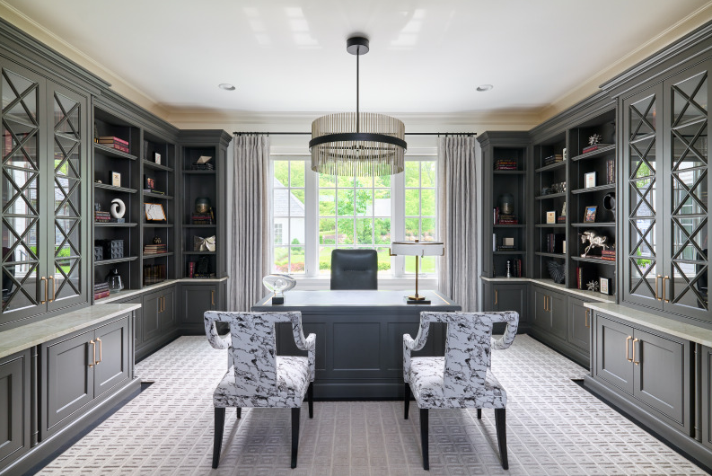
Tip 2: LIGHTING

One of our favorite ways to COMPLETELY transform a space with a single purchase, is to update the lighting. It is incredible what a game changer it can be to simply replace a ho-hum flush mount fixture with a chandelier or pendant; instant presence and “wow” factor is achieved.
When choosing your new light fixture, take some time to think about how you accessorize an outfit! The same rules will apply to your décor. Choose something complimentary to the style and proportion of your room. As with any look, “jewelry” and sparkle adds the layer of extravagance we are craving!
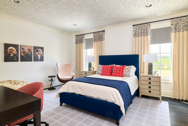
Tip 3: BE MINDFUL HOW YOU USE PATTERN

Use of pattern can be tricky! When properly assigned, considering scale, color, intensity and form, pattern can completely elevate your overall aesthetic. However, whatever is a blessing can easily become a curse! When NOT used correctly, pattern can also be your downfall. Due to its heavy influence, many people are intimidated when it comes to making selections. Exasperated questions like, “Where do I use it?” and “How MUCH should I use?”, ring through yet-designed spaces. That does NOT need to be the case!
Allowing one pattern to ground your selections, then mix and match larger and smaller scales and colors to compliment the “main event”. When done properly, a room that may have been easy on the wallet will look like a million bucks!
If you’d love some additional guidance before you embark on your design journey, we welcome you to check out our online course, The Decorating Genius System (DGS). The results my Design Lovers get are truly amazing – spanning all design styles and budgets. Click here for more information.


